Selecting the Perfect Wedding Colors
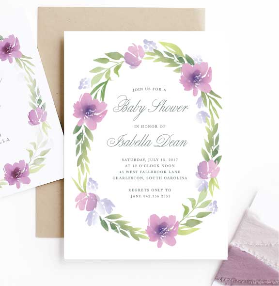
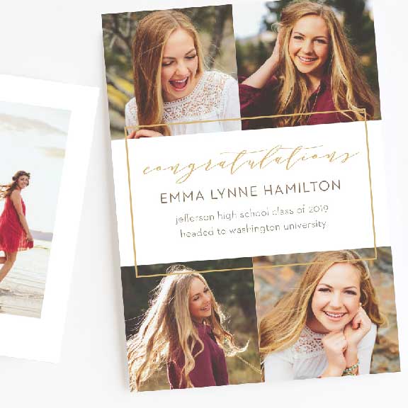
We have 168 different colors for you to select from. They can be used on any card, on any card element, in limitless combinations. You are able to order a free custom sample from us and see your chosen colors as well as all of these colors printed.
Use these great colors on any card
For most, you already have a color in mind; such as a favorite color carried over from childhood. There are no hard-fast rules when it comes to selecting your wedding colors. Start with what you like, and the rest will fall in to place. You may also find it useful to make a color inspiration or mood board.
Generally you’ll want to start by selecting your primary color and then choose 1-2 additional accent colors. While you can select more, it becomes more difficult to create a cohesive look. Using a color wheel and one of these three scheme patterns will help to ensure you pair colors that work well together.
Analogous

Monochromatic

Complementary

Pair with a Neutral
Once you have selected your primary and or accent color, you’ll want to choose a tasteful neutral color to pair it with. Neutral colors can play a major role in the tone of your wedding. Black and white create a formal, classy atmosphere, where as hues such as cream and gray tend to soften the event. Metallics are perfect for glamming up your event while adding a touch of drama.
Some popular neutral tones from our collection.
Putting it all together
It is common to take seasonal considerations when merging the perfect scheme. Each season has foliage, colors and fashion faux pas associated with it. Consulting, with these can be beneficial to any even, but it is important to remember, rules are meant to be broken, so don’t let it discourage you if your color pairing doesn’t fit with the season of your wedding. There are plenty of other ways to everything together tastefully.
Spring Colors
Spring colors tend to be light and airy, think pastels. They can also easily flow into the more bold and vibrant colors of summers.
5 Popular Spring Palettes
-
Pink, Mint and Gold
Rose
Grasshopper
Pseudo Gold
-
Yellow, Blue and White
Buttercup
Marina
White
-
Orange, Mint and Cream
Pumpkin
Pistachio
Cream
-
Gray, Yellow, and Cream
Dolphin
Buttercup
White
-
Orchid, Lavender and White
Black Raspberry
Lilac
White
Summer Colors
Bright and warm colors, matching the bold flowers and foliage of the season. Summer is the perfect time to saturate your color choices.
5 Popular Summer Palettes
-
Gold, Pink and White
Pseudo Gold
Smoothie
White
-
Turquoise, Coral and White
Deep Aqua
Lust
White
-
Purple, Turquoise and White
Pansy
Tiffany
Lavender
-
Coral, Red, and White
Tea Rose
Raspberry
White
-
Yellow, Turquoise and Pink
Sunshine
Glass
Watermelon
Fall Colors
Much like the colors in nature, fall colors pallets start to lose their saturation. Taking the color schemes of summer and muting them. Fall color schemes tend to take on an earthy, organic feel.
5 Popular Fall Palettes
-
Purple, Gold and Black
Decadent
Pseudo Gold
Black
-
Burgundy, Tan and Cream
Carmine
Tan
Cream
-
Brown, Coral and Cream
Pseudo Bronze
Lust
Champagne
-
Orange, Gray and Coral
Clementine
Dolphin
Tea Rose
-
Turquoise, Gold and Cream
Glass
Old Gold
Wicker
Winter Colors
Neutral colors play a larger role in winter. Often this is the season you’ll see two neutral colors paired with an accent color, where as in the other seasons, the opposite is often true.
5 Popular Winter Palettes
-
Light Blue, Gold, and White
Tropical
Pseudo Gold
White
-
Light Blue, Silver and Black
Arctic
Pseudo Silver
Black
-
Cream, White and Black
Champagne
White
Black
-
Navy Blue, Light Blue, and White
Deep Sea
Cloud
White
-
Mint, Burgundy, and Cream
Grasshopper
Carmine
Wicker
